 It takes a mere 10 seconds for a consumer to form a first impression of a logo for a particular brand. Whether we’re talking about the logo for our favorite potato chip maker or our favorite football team, we can all agree that logos and branding have a big impact on our final opinions about something.
Sports logos, in particular, can be incredibly powerful when they’re well-designed. Read on to learn about some of the most influential, classic logos from sports teams from the last decade.
The Best Logos of the Decade
We don’t have time to cover the top 100 logos of recent history, but we can touch on some of the best ones from the last 10 years. Here are some great logos that either came into being or were redesigned in this past decade:
Philadelphia Union
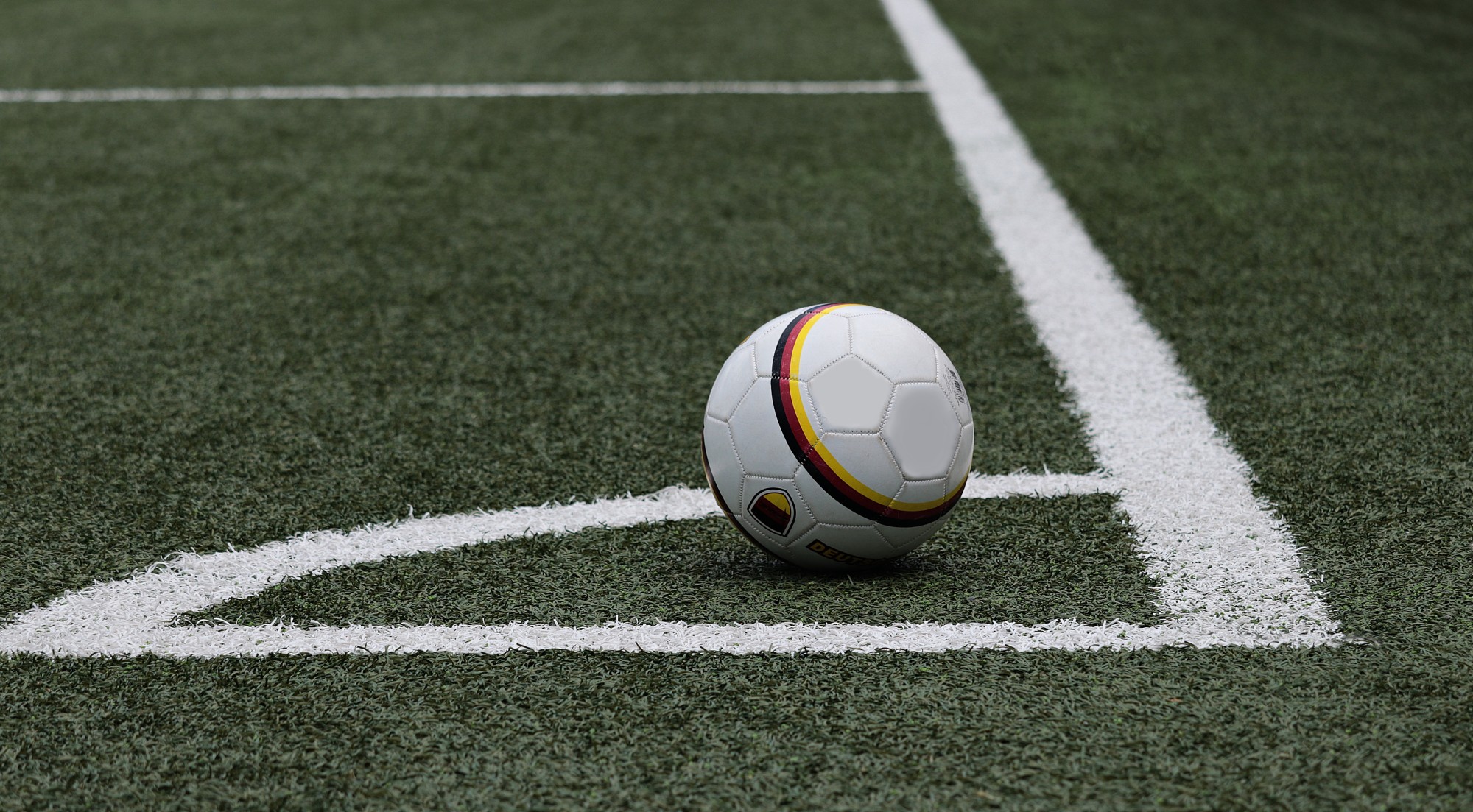
With its bold black, gold, and blue colors, this soccer team’s logo is easy to pick out. It also does a great job of including the team’s mascot.
Nashville Predators
The Nashville Predators hockey league also has an eye-catching logo. The use of the roaring mascot is an especially nice touch.
Minnesota Timberwolves
This logo features both the team’s mascot and cleverly incorporates a basketball into the design. It’s a well-rounded logo that definitely turns heads.
Southern Illinois Salukis
We can’t forget about the logo for the Illinois Salukis, either. This NCAA team’s logo is simple and straightforward, and the monochromatic design makes it easy for people to spot and recognize.
What Makes a Great Sports Logo?
At this point, you might be wondering what criteria are considered when choosing these logos. There’s a lot to keep in mind, but the following are some key points that make an award logo that stands out from the crowd:
Color
Any logo design expert will tell you that color has a huge impact on a team’s logo. All of the logos listed above make great use of color and catch people’s attention from far away.
Timelessness
The best logos are the most timeless ones. When designing a logo, it’s important to think about what will look good 10, 20, or 50 years from now, not just what is on-trend at the current moment.
Font
The font has a big impact on the impressiveness of a logo, too. The fonts in all of the logos listed above are bold and exude confidence. They show that the team has confidence in itself and, by default, encourages the fans to have confidence in the team.
Originality
Finally, we can’t forget about originality. Even if you’re using a logo generator to create your team’s logo, you still need to have a design that is different from other teams’ logos and is easy to pick out in a crowd.
Which of These Classic Logos Is Your Favorite?
As you can see, there are tons of classic logos that have changed or come into being over the last 10 years. Which one of these is your favorite? What are the worst sports logos you’ve seen in the last decade?
Be sure to check out some of our other sports-related articles to learn more about the teams behind the impressive, award-winning logos. From sports logo fonts to the teams’ top players, there’s a lot to stay educated on.